Handoff
Mail, Safari, Maps, Messages, Pages and more, picked up on whichever device you moved to, at the point you had reached.
At launch
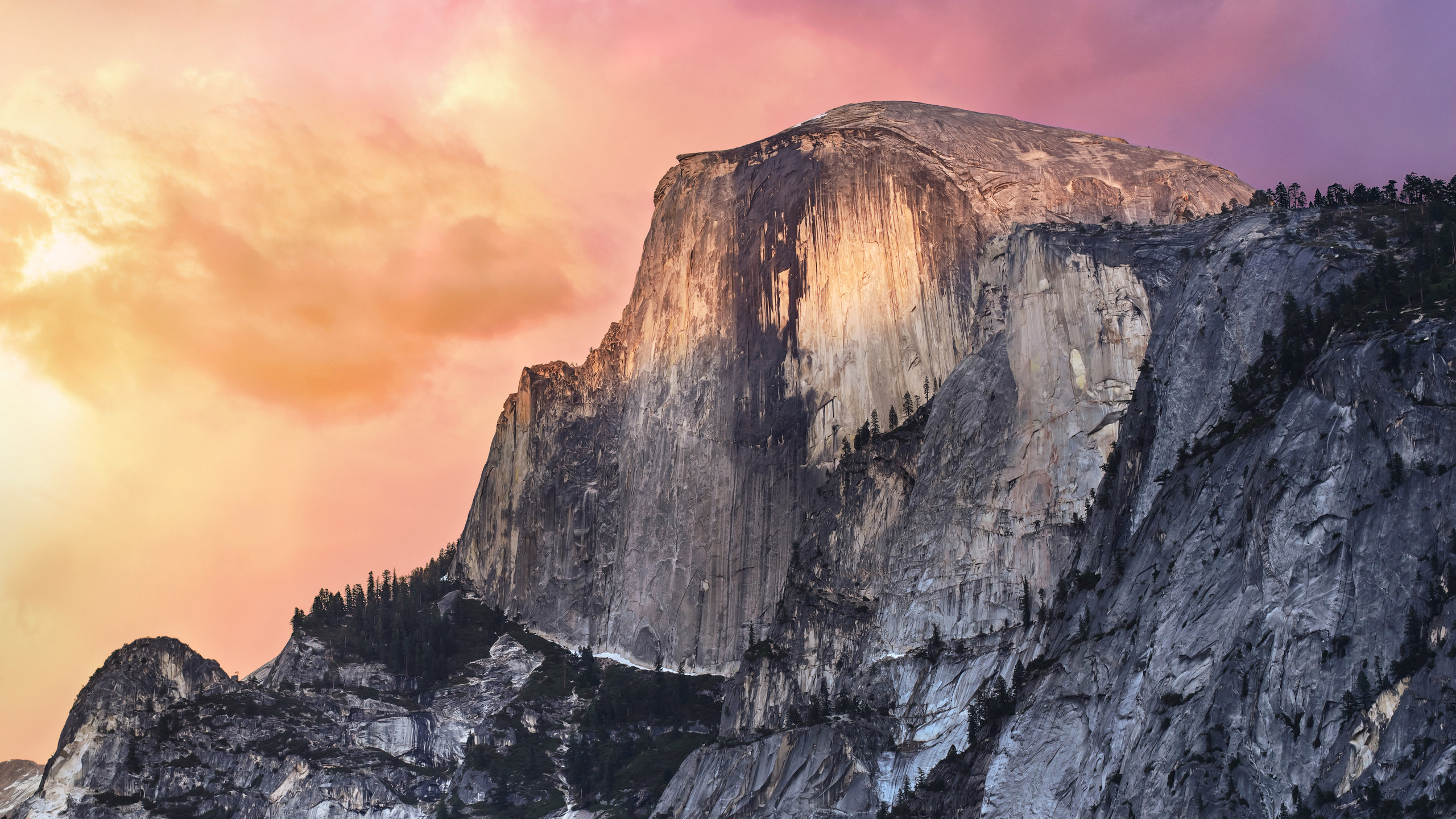
Flattened, and joined to your phone.
Overview
Yosemite did to the Mac what iOS 7 had done to the iPhone the year before: stripped out the gradients, the gloss and the texture, replaced Lucida Grande with Helvetica Neue, and made translucency the organising idea instead of shadow.
Alongside it came Continuity, and this is the part that lasted. Handoff moved a document between devices mid-sentence. Your Mac could answer the phone. SMS from Android friends started appearing in Messages. AirDrop finally worked between a Mac and an iPhone, three years after it had worked between two Macs.
Continuity
An icon appeared at the end of the Dock when your iPhone was nearby and mid-task. Click it and the same mail, the same page, the same map opened on the Mac at the same place. Calls rang on the desktop; hotspots connected without a password.
A task handed from the phone to the Mac
Features
A new surface, and the beginning of the Mac and the iPhone behaving like one device.
Mail, Safari, Maps, Messages, Pages and more, picked up on whichever device you moved to, at the point you had reached.
At launch
Calls rang on the Mac and green-bubble text messages relayed through the iPhone, so Messages finally showed every conversation.
At launch
Translucent sidebars and toolbars, no more brushed metal or pinstripes, and Helvetica Neue in place of Lucida Grande throughout.
At launch
Out of the corner and into the middle of the screen, with rich previews, web results, conversions and Wikipedia inline.
At launch
iCloud finally became an ordinary folder in the Finder that you could put anything into, rather than a per-app silo.
At launch
Attachments up to 5 GB routed through iCloud, and annotating a PDF or image without leaving the message.
At launch
A checkbox to darken the menu bar and Dock — not Dark Mode, but the first admission that some people wanted the interface to stop glowing.
At launch
Plug in an iPhone and record its screen — the tool behind a great many app demo videos ever since.
At launch
The replacement for iPhoto and Aperture, built on iCloud Photo Library, arriving as a point update in April 2015.
Added in 10.10.3
Typography
Lucida Grande had been the Mac's system font since 2001. Yosemite replaced it with Helvetica Neue, which looked cleaner at Retina sizes and noticeably worse on the non-Retina screens most people still had.
El Capitan replaced it again a year later with San Francisco, drawn in-house specifically for screens, with optical sizes for text and display. That one stuck, and it is what these pages are set in on a Mac.
Desktop
The park the release was named after, shot from the north with the sky going pink behind the granite.
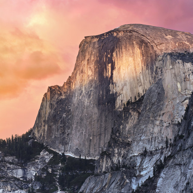 YosemiteHalf Dome, north face
There was only ever one. A system-wide Dark Mode did not arrive until Mojave in 2018, so this page's light and dark appearances are ours, not Apple's — the switch in the corner still works, but the desktop of the day looked like this and only this.
Lineage
California landmarks from Mavericks onward. Yosemite took the national park, and Apple stayed in it for a second year.
macOS 10.9 · 2013
Free, for the first time — and the first named after a place rather than a cat.
macOS 10.10 · 2014
The flat redesign, and Continuity tying the Mac to the iPhone.
Compatibility
The same list as Mavericks once again, though the translucency was demanding enough that older machines were often better off with it turned down.